Lakeland Network
Services Used
Logo Development
Brand Guidelines
Graphic Design
Signage
Brochure Design
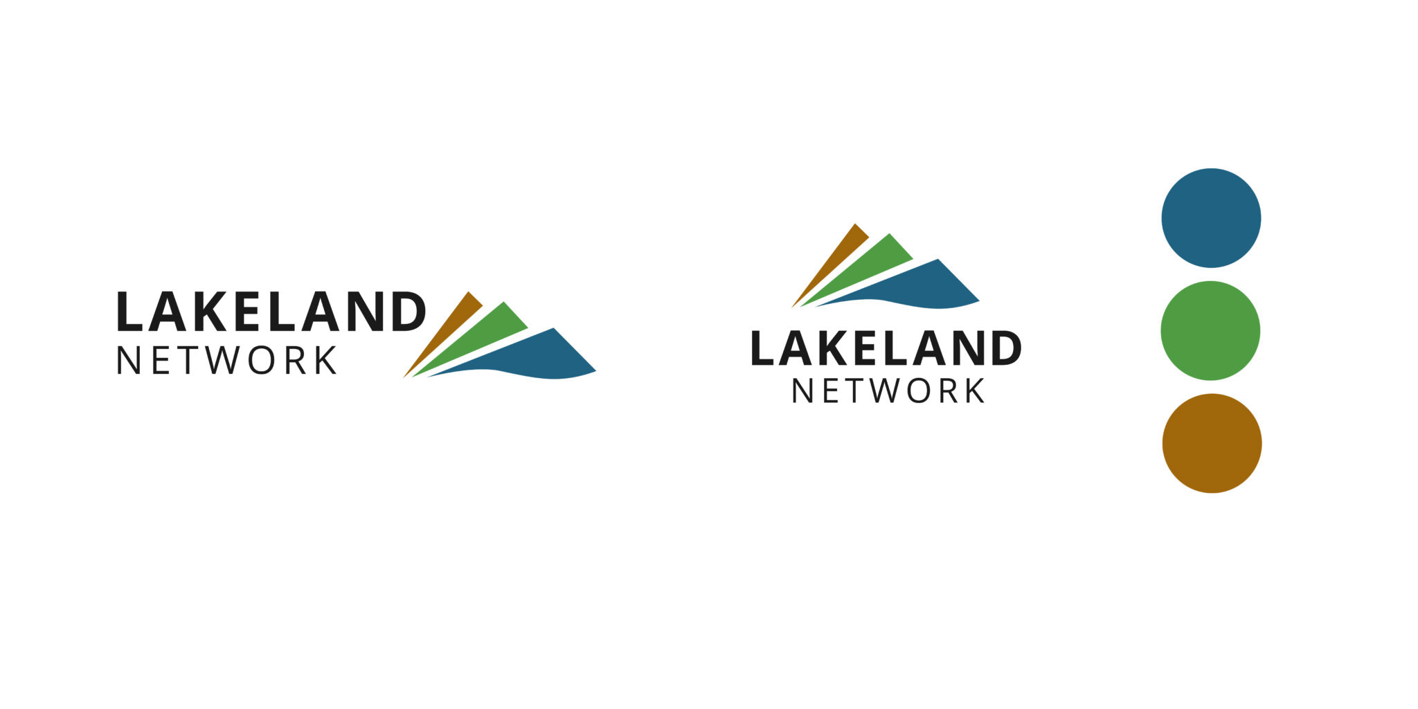
When the team at PowerNet Limited approached us to develop a logo for Lakeland Network Limited, we knew we were in for an exciting project. The brief was simple – the logo needed to reflect the stunning landscapes of Central Otago, including the alpine regions and lakes. But it also had to look right at home with the branding of associated networks like PowerNet Limited, Electricity Invercargill Limited, and The Power Company Limited.
Our design process began with a deep dive into the essence of Central Otago. We wanted the logo to represent the mountains, serene waters, and diverse landscapes that define the area. The initial concepts we presented featured elements that symbolised the region’s natural features, using a colour palette inspired by the alpine scenery and lower hills around Queenstown.
Brand Development
Once the initial concept was approved, we developed three different iterations of the logo. Each version built upon the core ideas of the concept and explored different ways to capture the essence of the landscape. The final logo was selected for its simplicity, effectiveness, and strong representation of the Central Otago area.
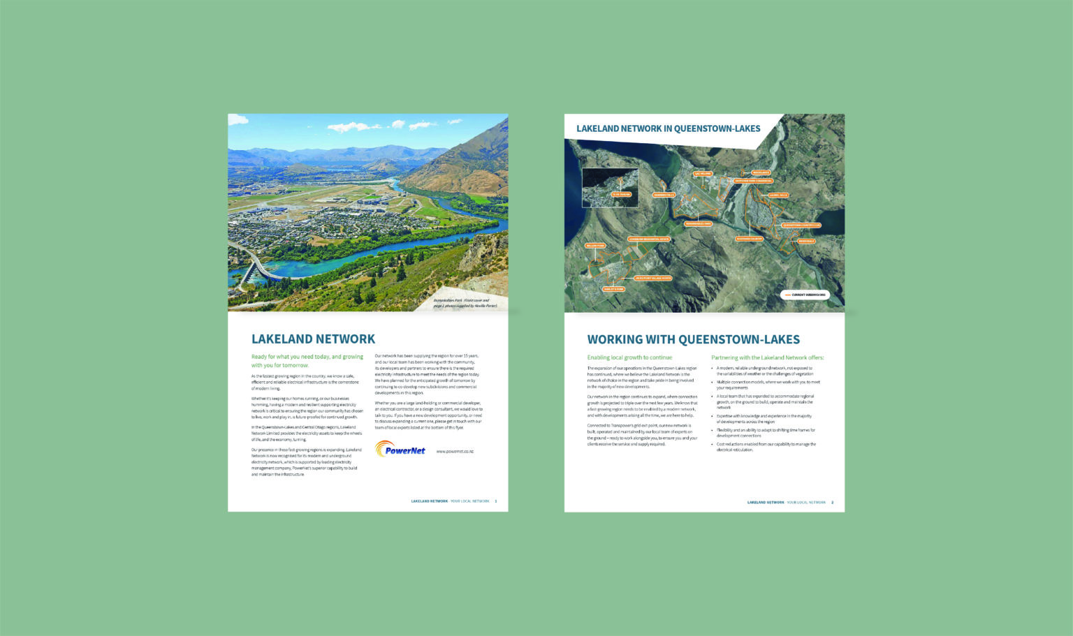
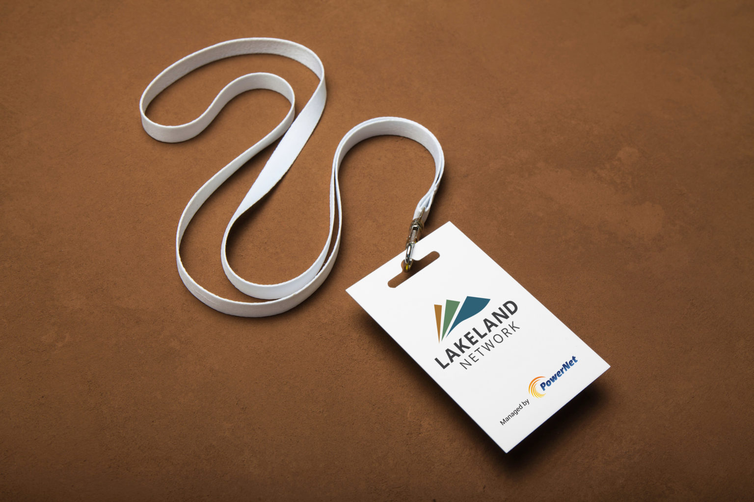
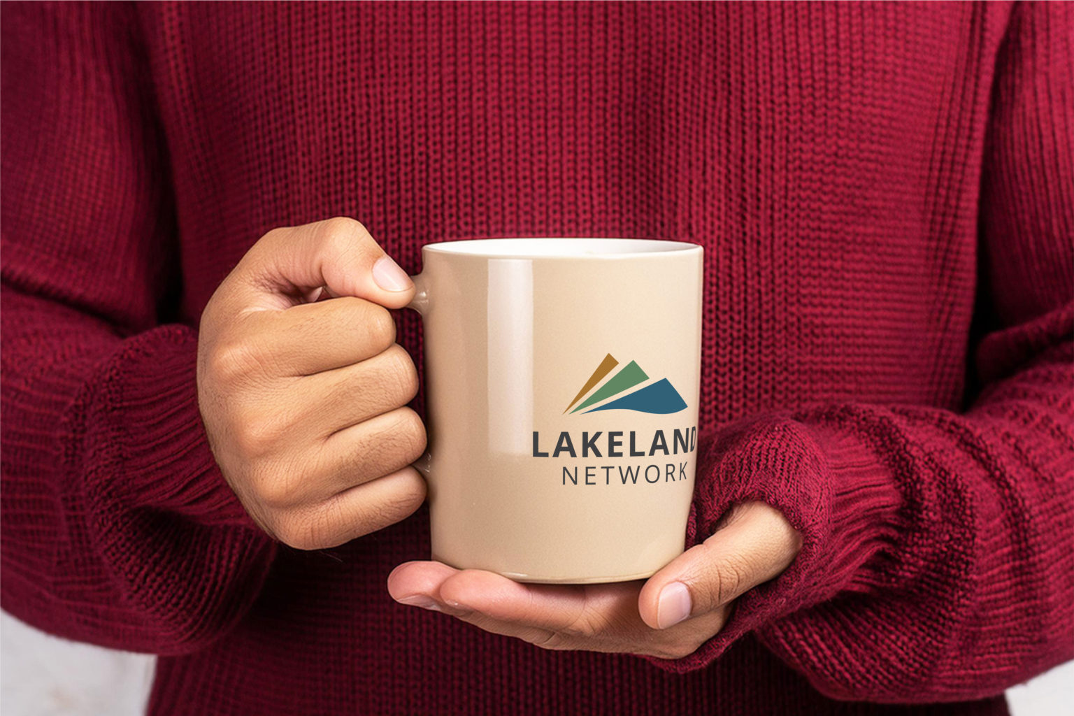
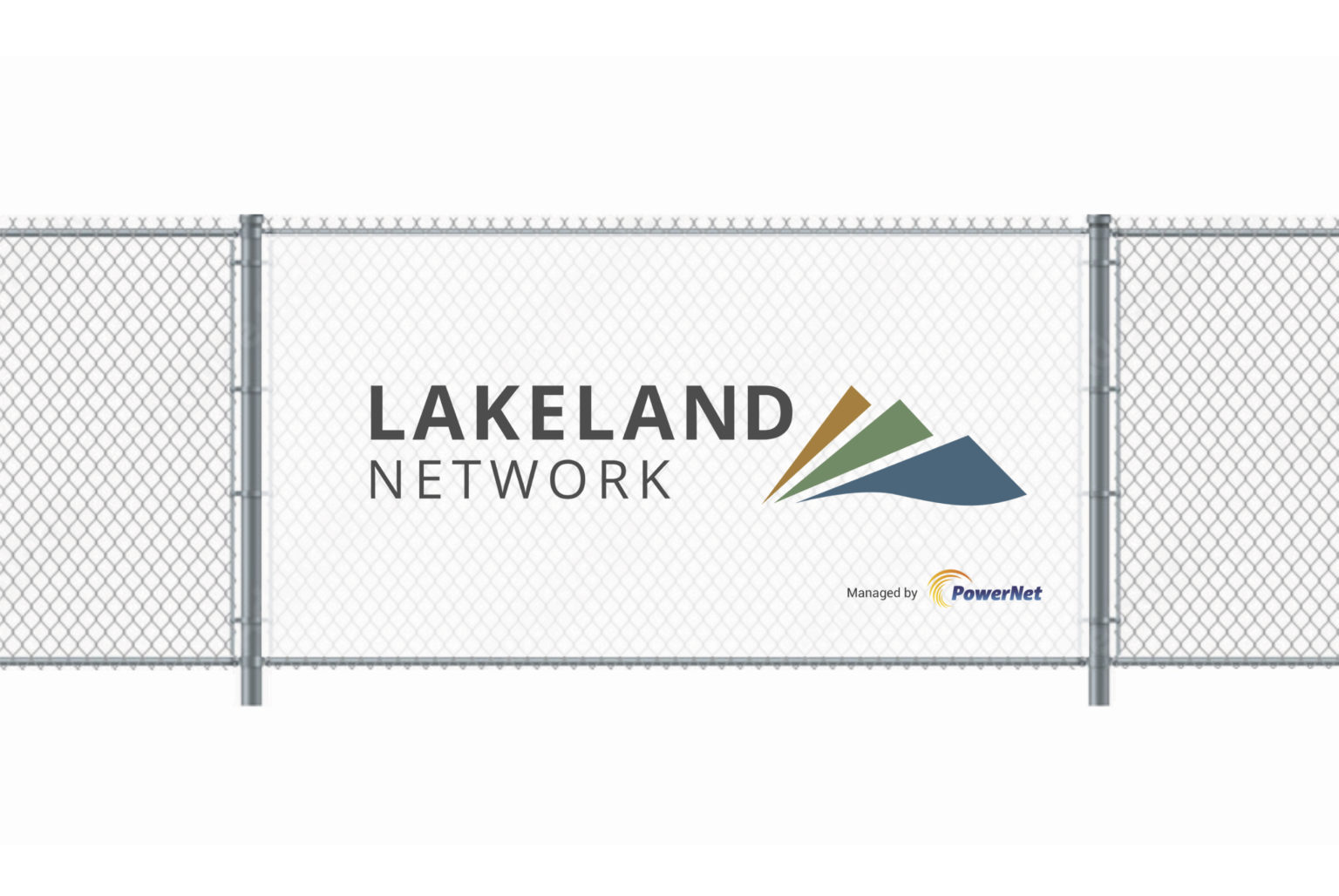
With the final logo in place, we continued designing for the brand across various collateral materials such as signage and flyers that maintained the visual identity established by the logo. The end result was a brand developed to be distinctly Lakeland Network Limited that not only resonated with the natural beauty of the region, but also stood confidently alongside its sister networks.
FAQs
We know working with a design team can seem daunting. But here’s a few common questions that tell you a little more about working with us.
Every client and project is unique, but our objective always remains the same. Unlike other studios where you will only communicate with a project manager, every one of us is hands-on, and your point of contact will be the person working directly on your project. This ensures a more personalised and direct line of communication and allows for a better understanding and execution of your vision.
Something unique about us is we are all on the tools! What does this mean for you? Well, it means you when you meet with us and brainstorm for a project you will be talking with someone who has a good understanding of how the ideas could be executed, pick up any road bumps or even push the ideas further.
Something unique about us is we are all on the tools! What does this mean for you? Well, it means when you meet with us to brainstorm a project, you will be talking with someone who has an understanding of how the ideas could be executed, can pick up any road bumps, make recommendations, or push ideas even further.
Our team is intentionally small, valuing direct client contact and having the ability to deliver a more personalised experience.
Many of the skills needed within graphic design and visual communication services relate to one another. With a strong theoretical and practical understanding (as well as a heck of a lot of experience) our team can be versatile in the services we offer.
But we also know our limits, having a range of other specialist professionals in our contact list to take charge when a required skill isn’t our strong suit.
Each of us understands the value of personal and professional development, and we never stop learning newskills or taking the time for training.
Not at all! We work with clients from various locations, and geographical proximity is not a limitation. We can communicate effectively through virtual meetings, phone calls, and email. Regardless of your location, we are committed to providing the same level of dedication and support to all our clients.